Give the brand a focus.
Connect quality, integrity and agricultural responsibility with a clear creative direction.
A signature logo, a clear brand voice and practical guidelines for an agricultural business in the Dominican Republic. One foundation for the way Sierra Negra looks and communicates.
Explore the identity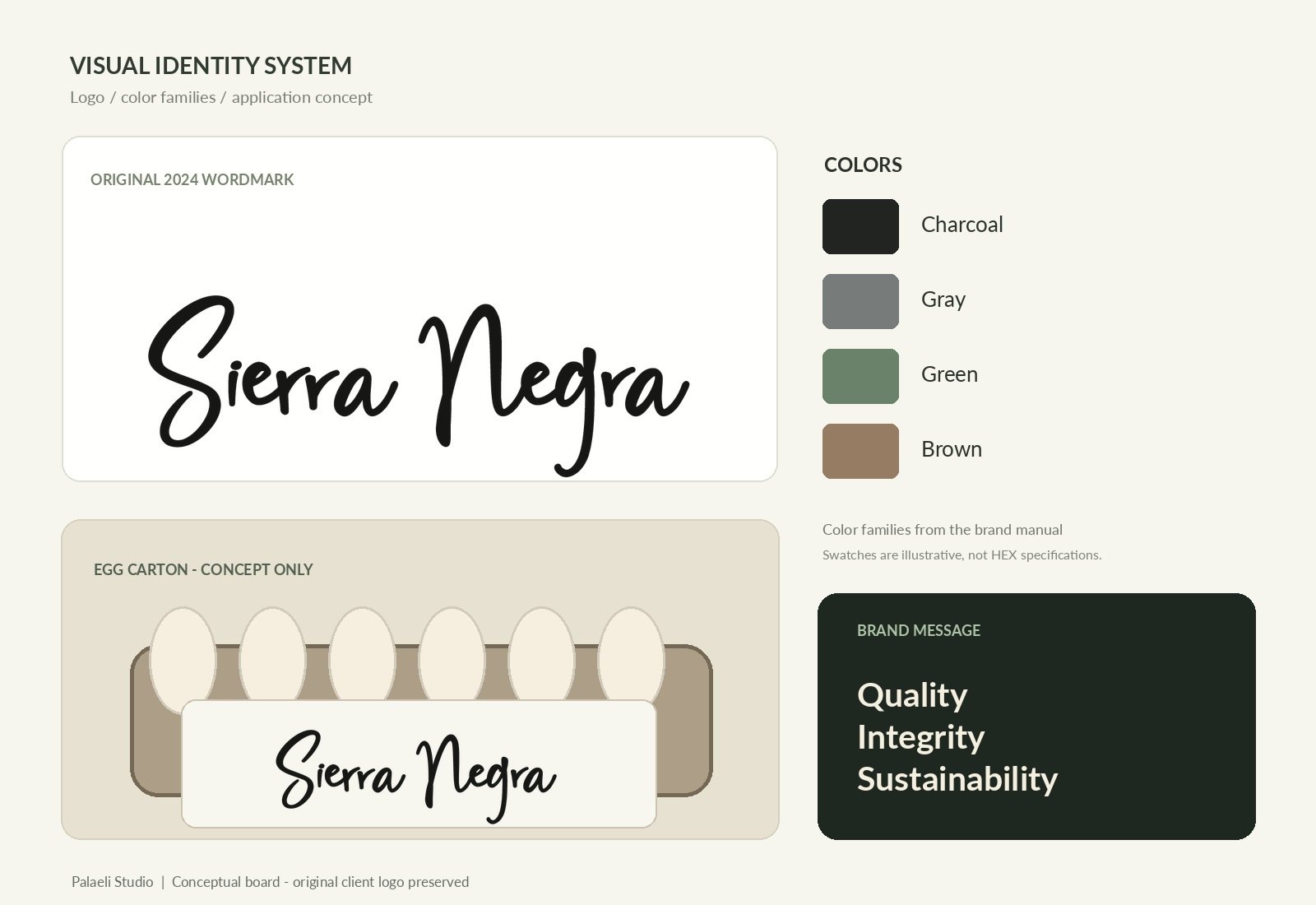
The original wordmark, shown with illustrative color families and a conceptual egg-carton application. Select the image to view it in detail.
The packaging illustration is a concept for this case study. The swatches show color direction rather than exact production specifications.
Sierra Negra produces and distributes eggs and farm animals in the Cibao region. Its brand positioning centers on quality, integrity and responsible agricultural practices.
The identity needed to feel connected to farming and the land while expressing the professionalism of a modern business. It also needed to work across different audiences and communication formats.
Our role was to translate those priorities into a distinctive signature and a shared set of visual and verbal standards.
Cultivating Quality, Harvesting Sustainability.
The statement connects care for the product with the brand’s long-term vision for farming and the environment.
Quality, integrity, nature and continuity shaped the creative direction. The sustainability message expresses the company’s positioning and aspirations.
Start with the business’s values, translate them into visual and verbal choices, then document how those choices should be applied.
Connect quality, integrity and agricultural responsibility with a clear creative direction.
Develop a handwritten wordmark with a grounded, contemporary personality.
Establish a voice that can inform, inspire and connect with customers.
Bring the visual system, brand voice and usage standards into one reference guide.
The Sierra Negra name becomes the focal point of the identity. Expressive lettering pairs with clean supporting typography and color families connected to the land.
The handwritten typeface behind the signature-style logo gives the name a personal, recognizable character.
Bold and light weights provide a clear, modern contrast for supporting information and longer communication.
Black and gray anchor the identity. Green and brown support its connection to farming, nature and the land.
The corporate manual documents the wordmark’s proportions, clear space, color direction and supporting typography.
Guidance for contrast, backgrounds and correct use helps different people and vendors apply the identity consistently.
Keep the original proportions and the relationship between the letters.
Maintain a protection area so surrounding content does not compete with the mark.
Choose backgrounds with sufficient contrast and avoid distortion or independent resizing of logo elements.
The communication guide connects authenticity, responsibility, innovation and professionalism with three complementary tones.
Use a forward-looking voice for environmental responsibility and the brand’s long-term aspirations.
Communicate agricultural processes, production and the business’s quality priorities in a clear, professional way.
Make consumer and community communications feel welcoming and easy to understand.
Delivered in July 2024, the completed project brought the strategy, design and communication standards together in a reusable brand system.
Positioning, brand personality and messaging aligned with the business’s agricultural values.
A signature logo, coordinated typography, primary and secondary color families and usage standards.
A corporate identity manual, scalable vector artwork and image versions for different communication needs.
The finished system gives Sierra Negra a consistent way to introduce the business, communicate its values and guide future creative work.
A shared foundation helps each new application build on the identity already in place, from sales materials and digital communication to possible packaging or signage.
Responsible for the complete project: brand strategy, creative direction, logo design, visual identity, brand voice, guidelines and project support.
Brand strategy · Creative direction · Logo design · Corporate visual identity · Brand voice & messaging · Brand guidelines · Reusable logo files
We turn a business’s vision into a practical identity, with the design, words and guidelines it needs for everyday communication.
Let’s talk about your brandExplore our branding services