Understand the vision.
Explore the business, audience and references. Define a direction rooted in trust, renewal and wellbeing.
From the first logo concepts to the details clients encounter in the salon. A visual identity built to carry a new business into everyday operation.
Explore the identity
Embelleciendo cada estación de tu vida.
Bringing beauty to every season of your life.
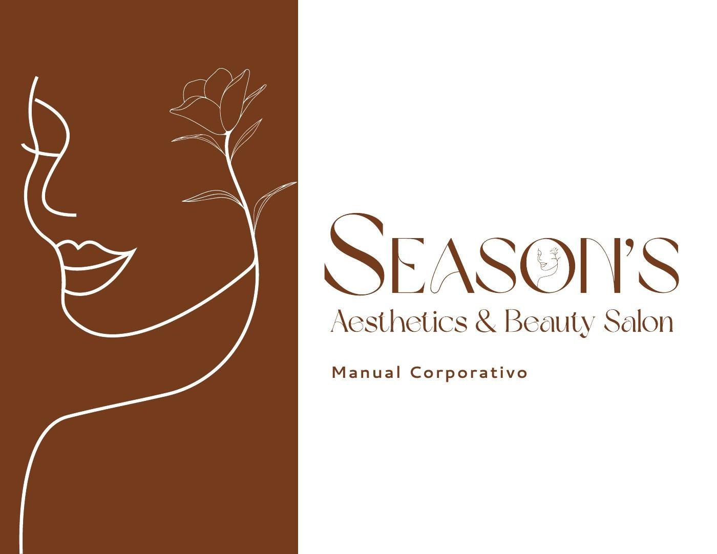
Original brand guidelines · 2023
Season’s was preparing to introduce a beauty and wellness business built around personalized care, renewal and confidence. It needed a visual identity that could communicate those qualities from the first encounter.
There was no existing logo. The identity had to balance elegance with approachability and feel at home across a card, a service menu, an appointment document and the salon environment.
We began by understanding the founder’s vision, audience and references, then developed a consistent visual language for the materials the business would use.
The name Season’s connected beauty and self-care with the different stages of a person’s life. That idea guided a calm, refined identity and its practical applications.
Explore the business, audience and references. Define a direction rooted in trust, renewal and wellbeing.
Compare logo proposals, lettering and organic visual forms, then refine the direction through feedback.
Establish logo variants, proportions, color, typography and usage guidance in a corporate identity manual.
Carry the identity into stationery, loyalty cards, clothing concepts, service brochures and salon signage.
A warm brown anchors the identity, supported by white, sage green and soft pink. A documented type hierarchy connects expressive brand lettering with everyday reading.
#82481D
Primary signature
#FFFFFF
Space & clarity
#93A693
Balance & wellness
#DB7FA9
A gentle accent
The expressive lettering used in the primary name.
A complementary style for “Aesthetics & Beauty Salon.”
A versatile reading family for supporting text and longer materials.
The manual brings together the brand’s mission, vision and values with logo proportions, positive and reversed versions, monochrome alternatives, color and typography.
Guidance for backgrounds, photography, contrast and incorrect use helps future materials stay consistent with the original identity.
The final editable artwork and documented rules give the business a foundation it can keep using.
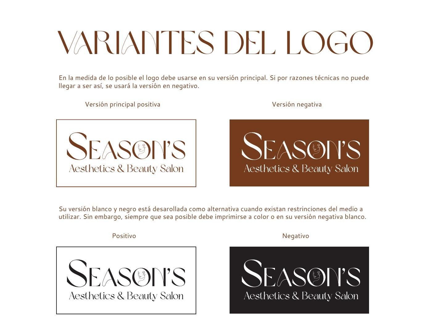
Approved logo variants · Excerpt from the brand manual
Personalized business card files for six team members, stationery and invoice layouts, and loyalty card designs extend the identity beyond its primary logo.
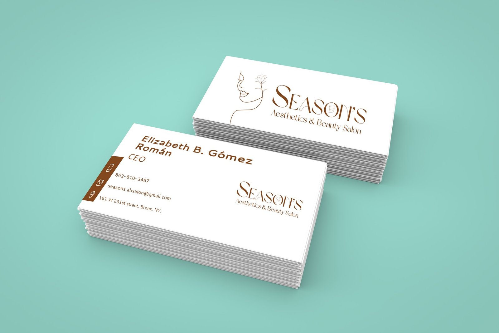
Original design presentation · A coordinated introduction for the team.
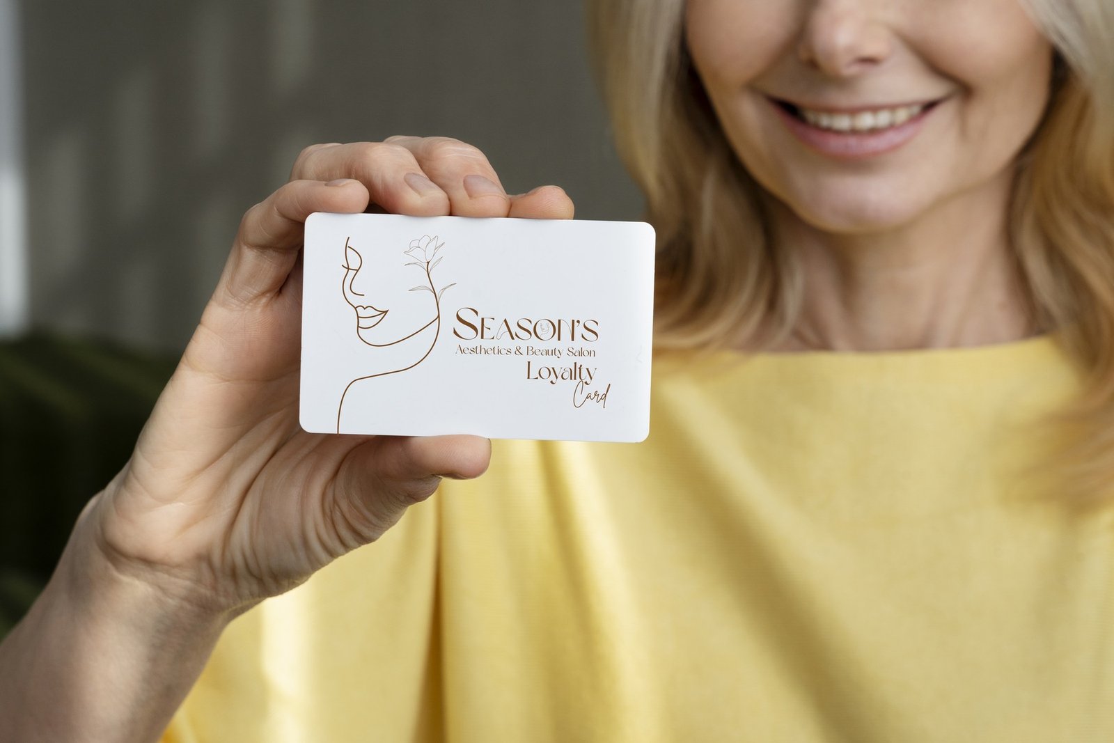
Original design mockup · A consistent identity for the next visit.

Brand application concept · Bringing the identity into the service environment.
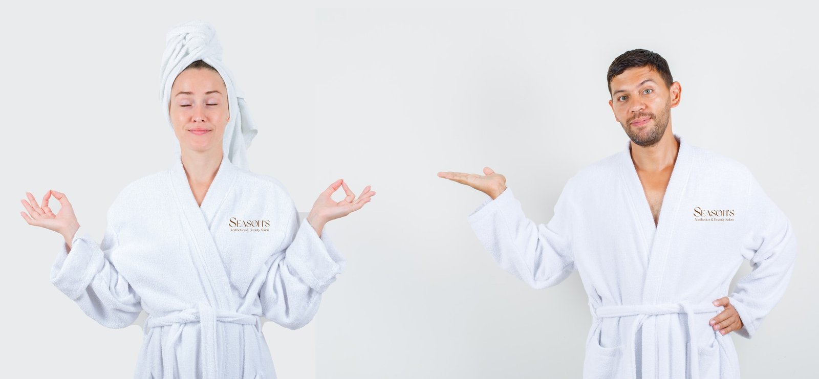
Brand application concept · A shared signature across the salon experience.
Four service categories share the same graphic foundation, with structured layouts and English and Spanish service information.
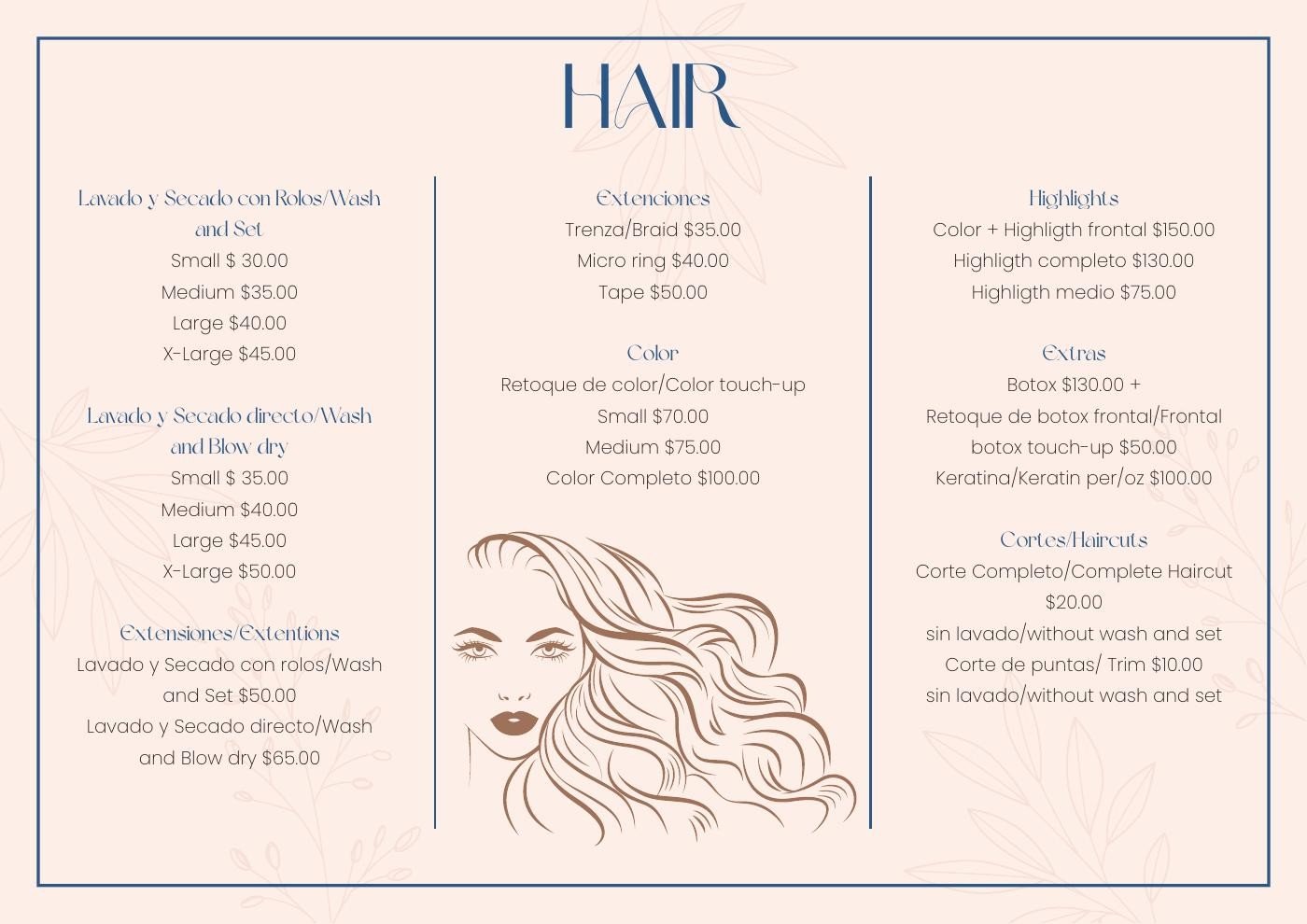
Styling, color and care.
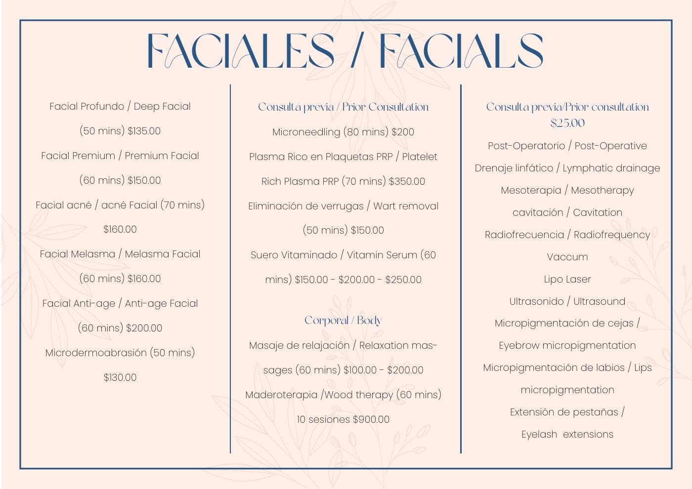
Treatment categories in a coordinated layout.
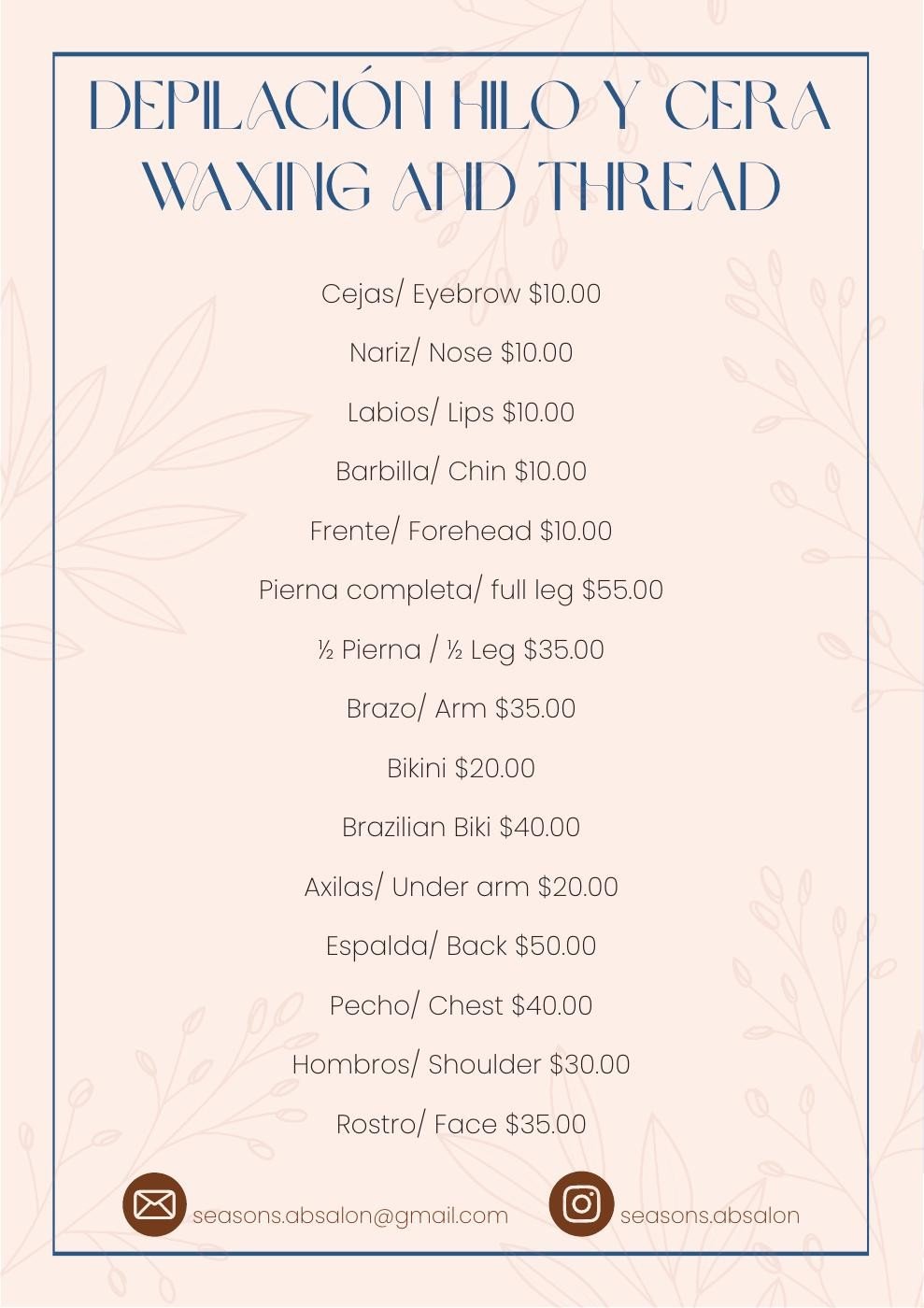
A clear service list with the same signature.
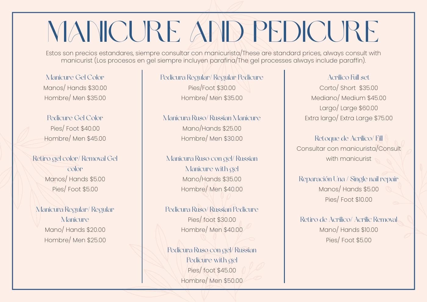
Detailed services, presented as part of one brand.
Original project artwork from 2023. Select an image to see the design in detail.
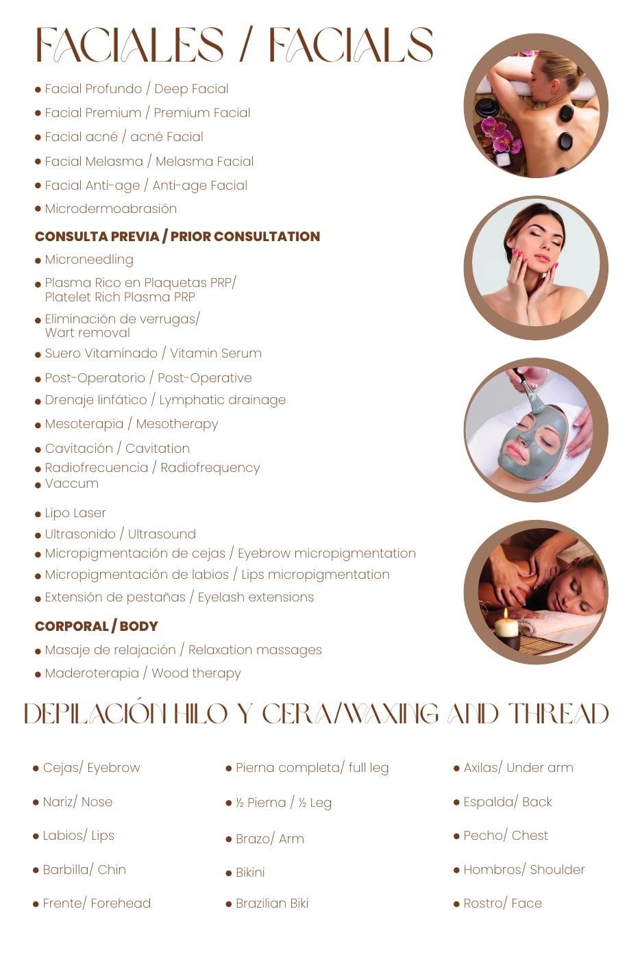
We prepared 24-by-36-inch signage designs that connect service information with the salon’s visual identity.
Consistent lettering, illustration and layout help the individual service areas feel like part of the same experience.
Original signage artwork · Design deliverable
The project delivered a recognizable identity, a documented system and coordinated applications across the places clients encounter the brand.
A refined primary logo, reusable artwork, defined colors and coordinated typography.
A corporate manual that explains how to use the identity consistently.
Cards, stationery, loyalty materials, clothing concepts, brochures and signage designs.
For Season’s, we translated an entrepreneurial vision into the visual tools used to introduce the team, explain services and present the salon.
The same decisions that shape the launch also give everyday materials a consistent place in the brand.
Designer of the complete brand identity and all graphic applications: logo, visual system, brand guidelines, business materials, uniform and spa robe concepts, service brochures and signage.
Project direction and support throughout the development of the brand and its applications.
Brand discovery & creative direction · Logo design · Visual identity · Brand guidelines · Business stationery · Loyalty cards · Uniform & spa robe concepts · Service brochures · In-salon signage design
We turn your vision into a recognizable brand built for the materials, people and experiences that support daily operation.
Let’s talk about your brandExplore our branding services